
Divergent Education
Streamlined solutions for dedicated educators.
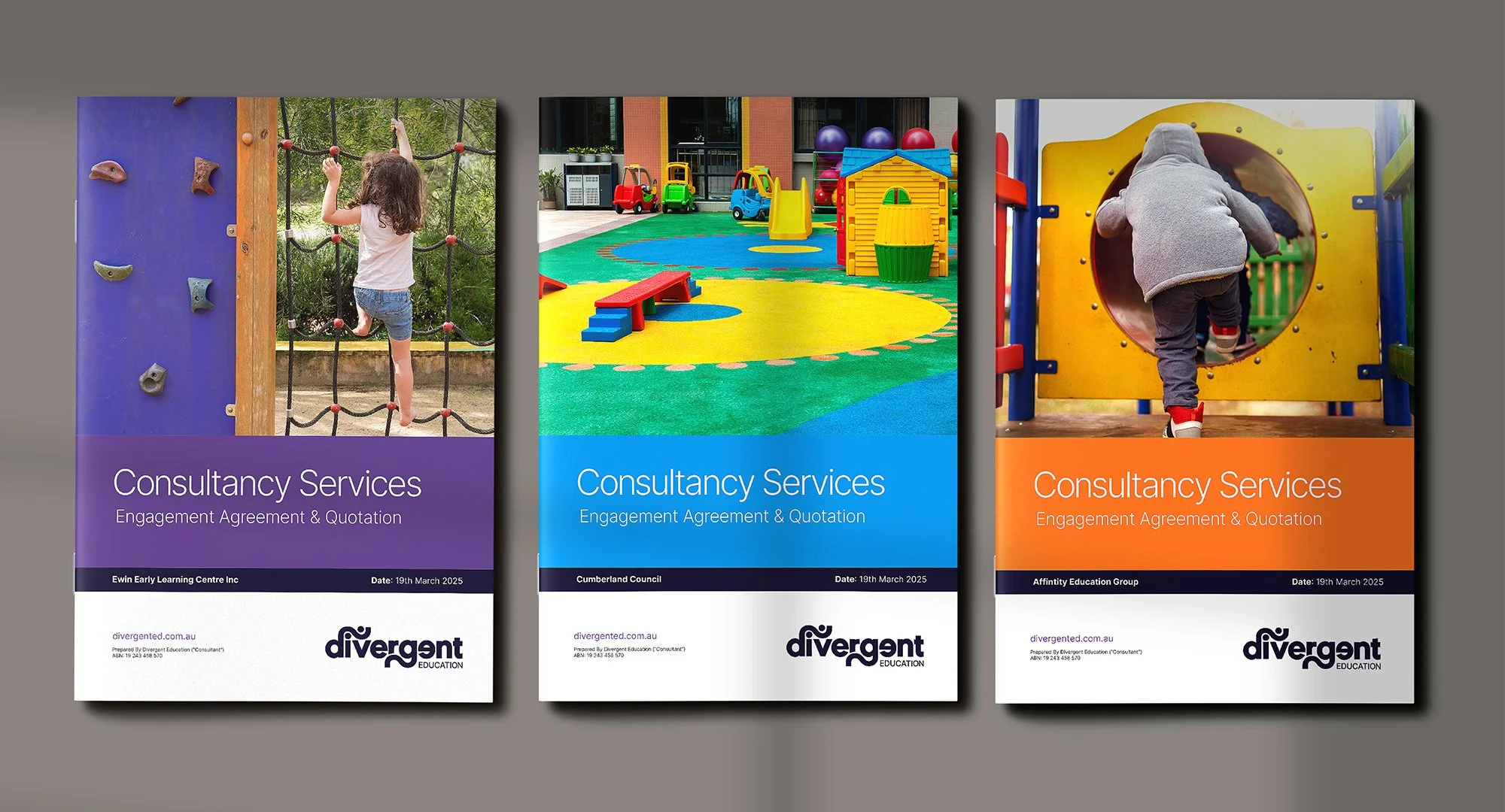
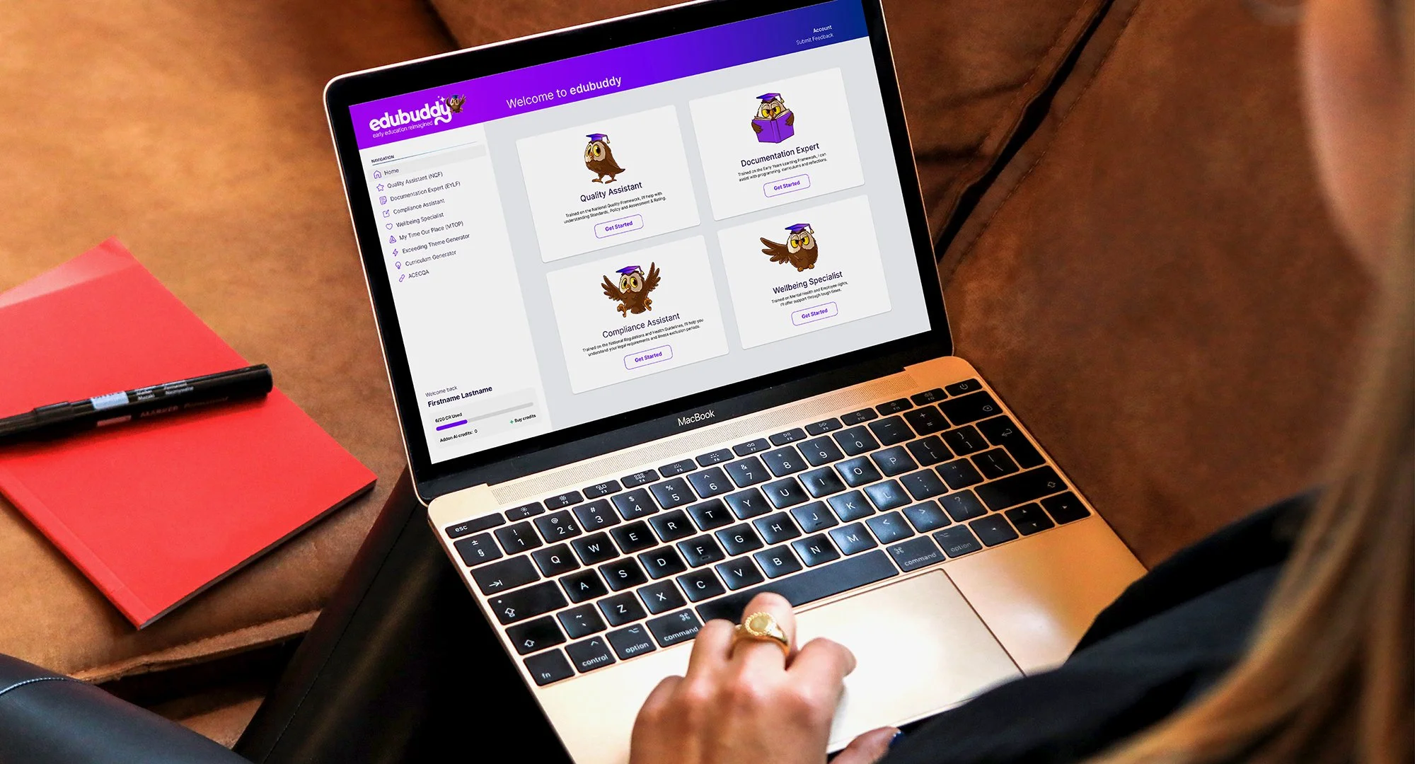
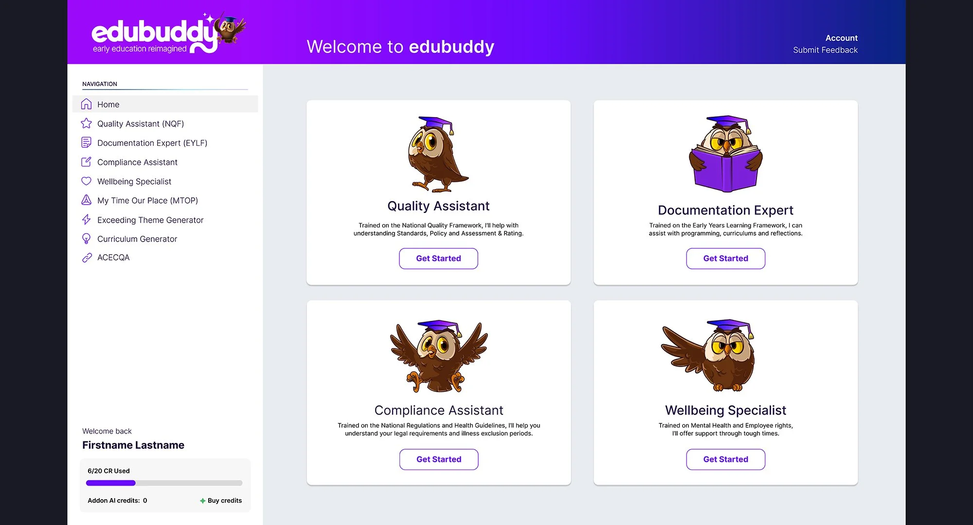
Handle Branding was engaged by Divergent Education to reimagine their brand identity with both purpose and clarity. Through our collaborative strategy and design process, we crafted a visual identity system that honors Chey Carter’s bold vision for Divergent Education bu across her other products and solutiosn for Edubuddy and QIPd . The new branding amplifies the organisation’s mission to empower early childhood educators, uplifting safety and inclusivity, and challenging conventional systems. The refreshed identity modern, thoughtful, and holistic now carries Divergent Education forward with personalty and positions them as a progressive advocate and trusted partner in early childhood education.

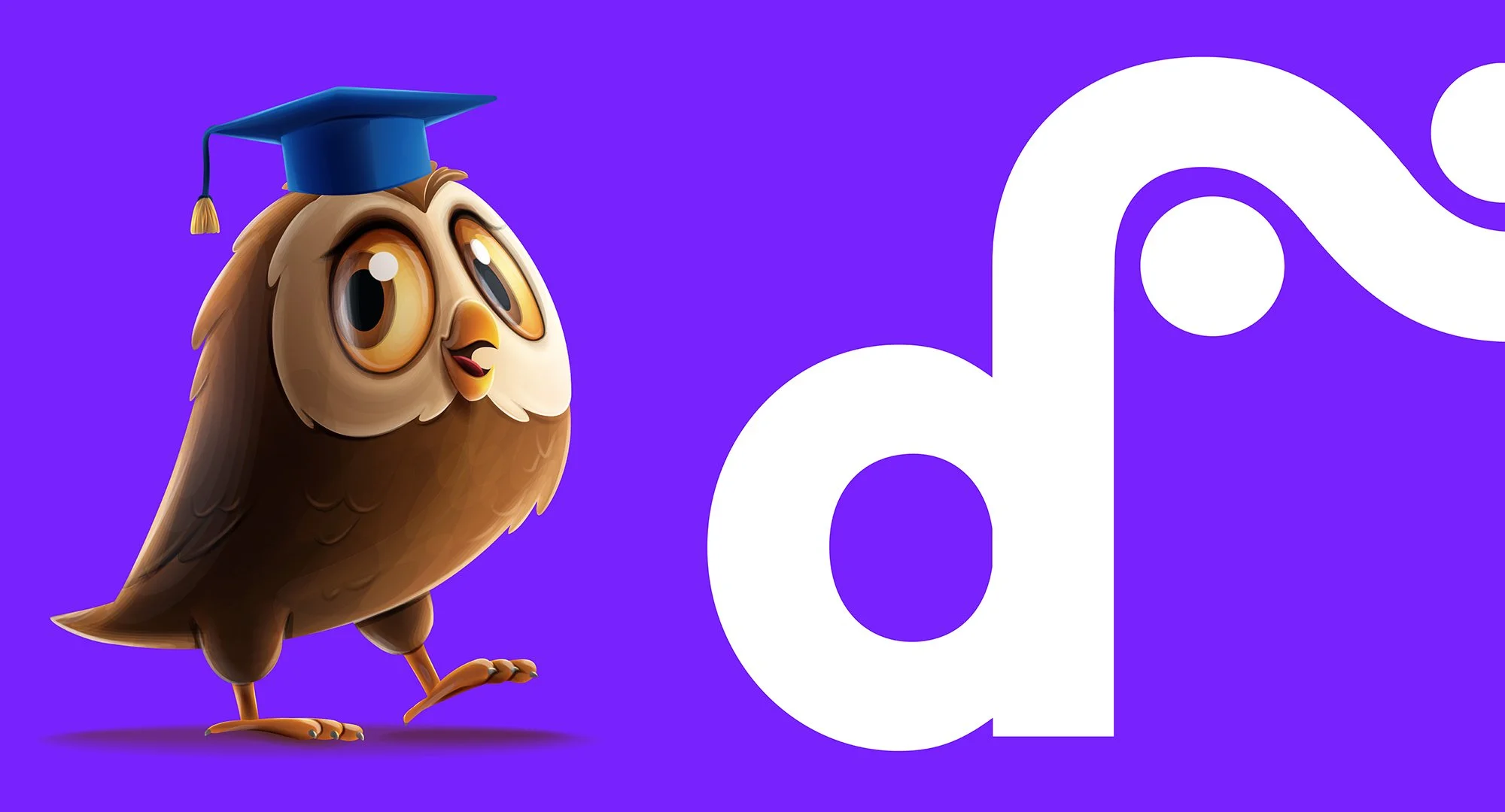
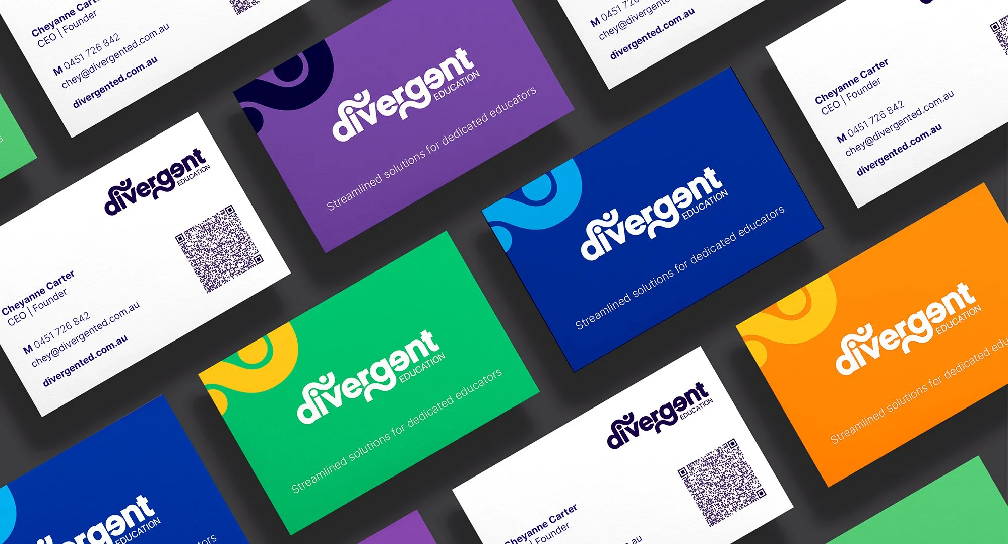

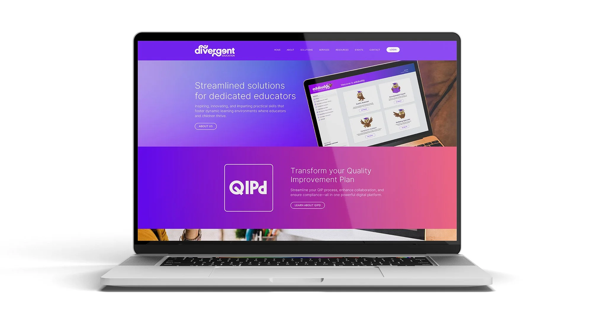
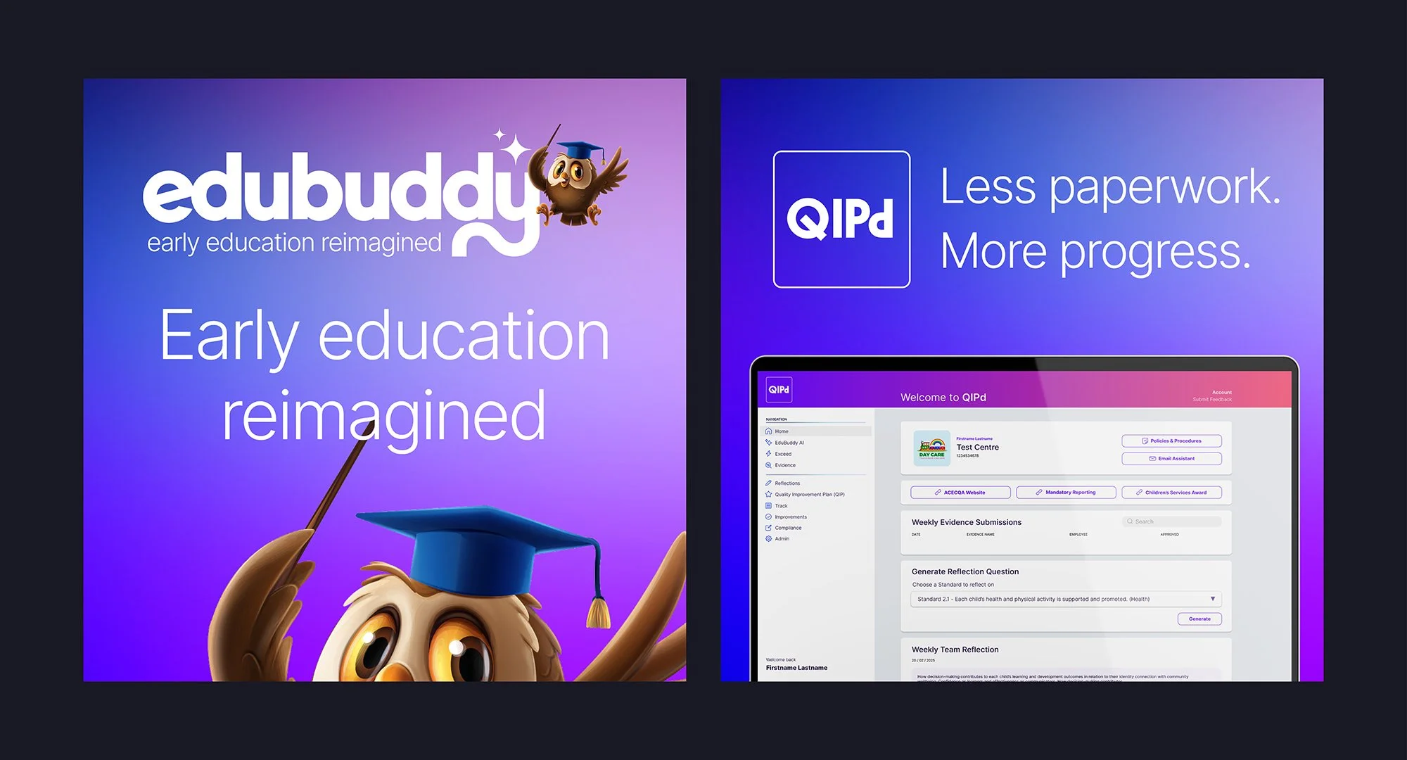
For Divergent Education, the creative challenge was to distil the spirit of divergence innovation, inclusivity, and courageous thinking into a coherent visual identity. We embraced a logo that balances clean, professional structure with asymmetrical details, symbolising lateral thinking and lateral paths rather than straight lines. A warm, yet bold colour palette supports this, offering emotional resonance and accessibility to a diverse early childhood audience.
Subtle graphic motifs draw inspiration from organic shapes and branching networks, reinforcing the brand’s commitment to nurturing unique learning journeys. The resulting identity is both grounded and expansive—a visual expression of divergence that supports educators, celebrates neurodiversity, and signals a new direction for the early education landscape.



Project Overview
Rebrand and repositioning
Visual Identity
Business Cards
Stationery
Flyers
Posters
Social Media Graphics
Website Concepts
Illustrations
