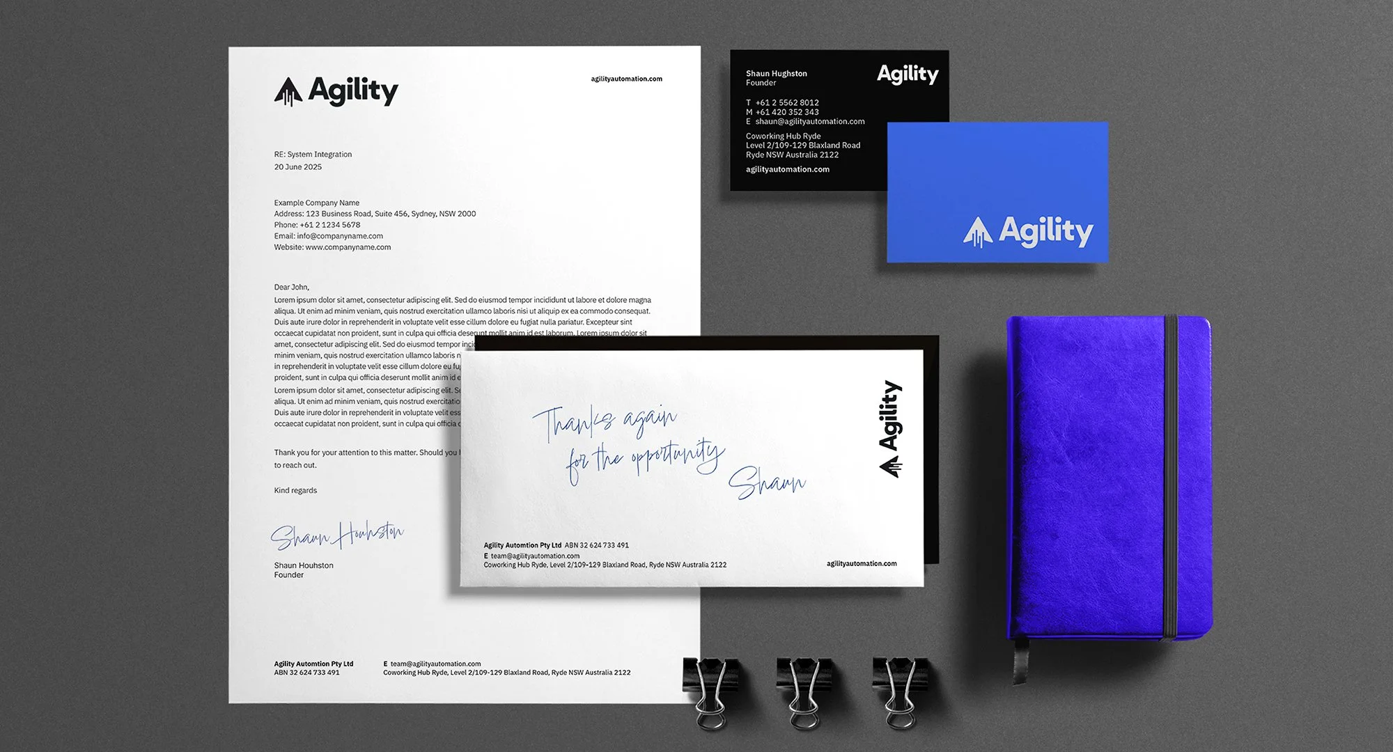
Agility Automation
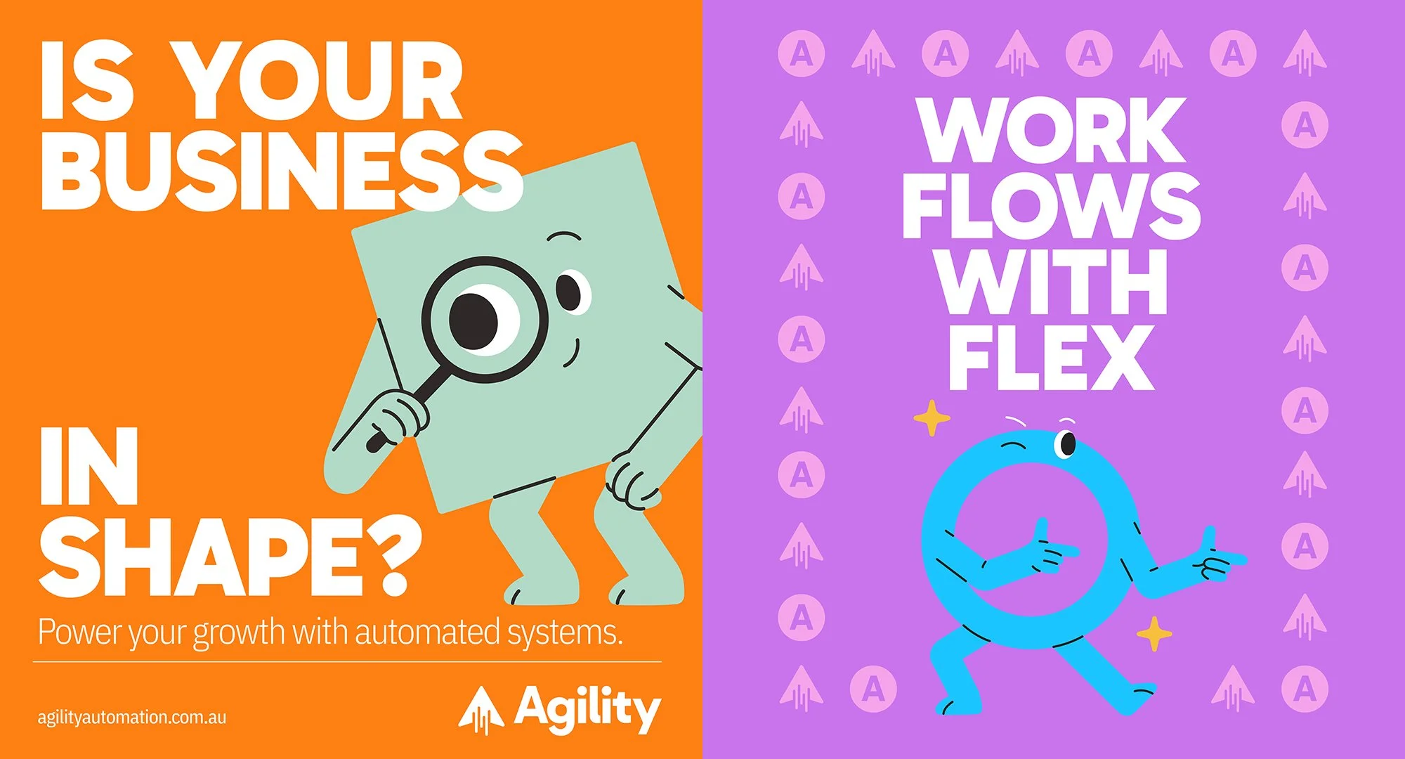
Works flows with flex.
Handle Branding was engaged by Agility Automation to undertake a rebrand that would capture not only a refreshed visual identity but also a deeper expression of the company’s purpose. Through our collaborative process, we developed a visual and verbal identity system that reflects Agility’s clarity of direction, the value they deliver to clients, and their forward-thinking approach. The new brand identity, defined by its modern design and cohesive messaging, strengthens Agility Automation’s presence in the market and positions them with confidence for their next chapter of growth.

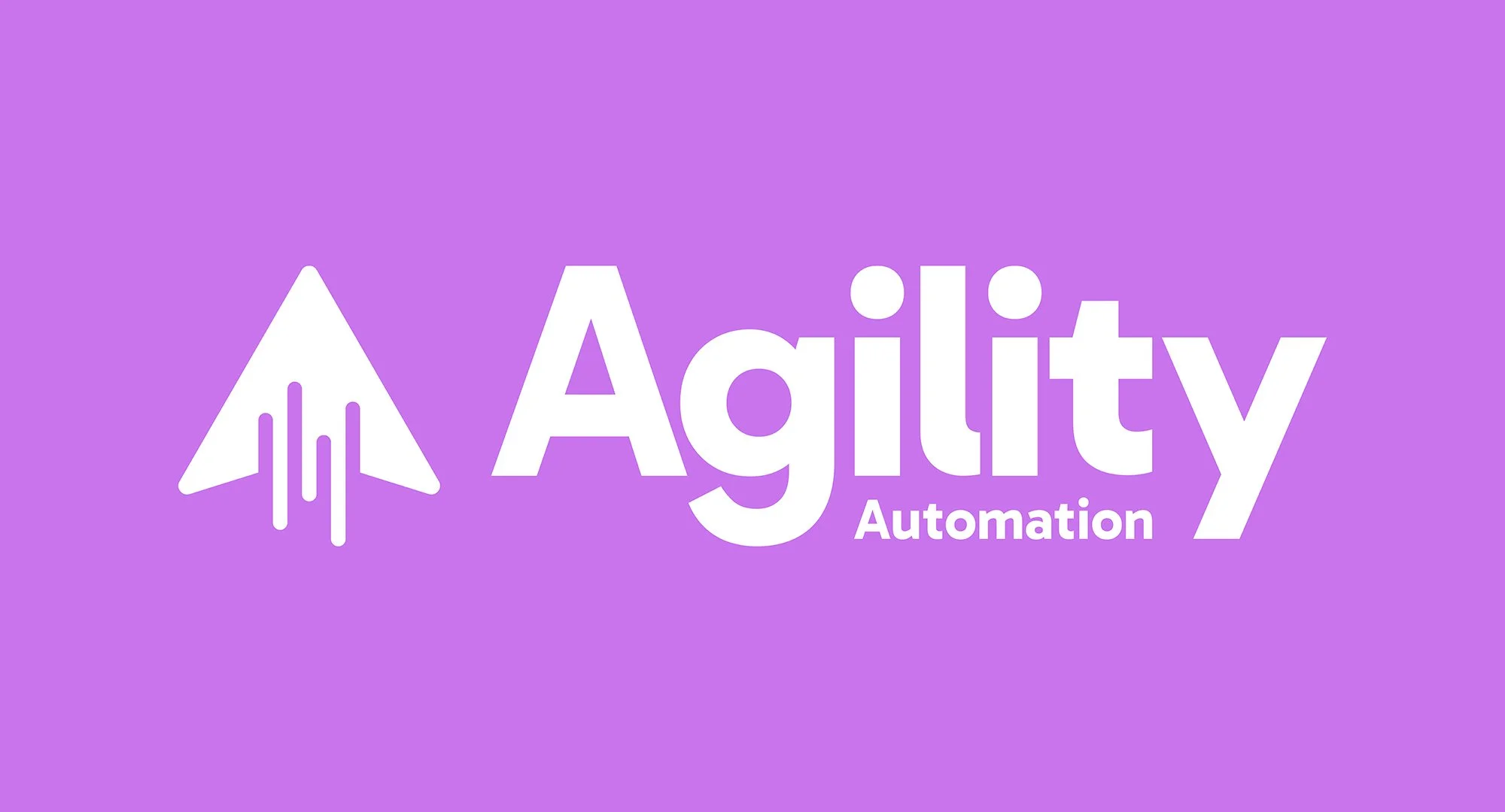

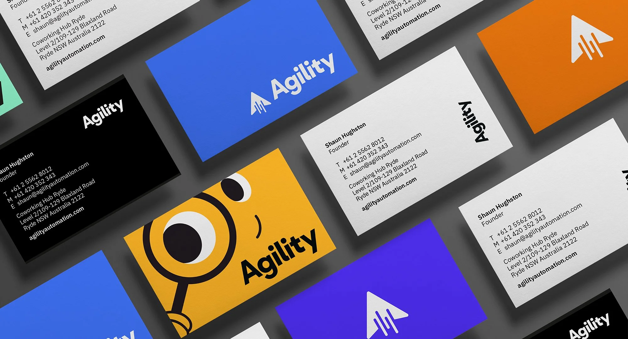
For Agility Automation, the design challenge was to capture the very idea of agility in a brand identity that feels fluid and adaptive. The new logo introduces clean geometry and subtle motion cues within its icon, creating a sense of forward momentum without sacrificing clarity. A confident yet flexible colour system reinforces this, striking a balance between energy and professionalism. Central to the identity is the arrow an element that not only nods to the letter ‘A’ but also evokes a mouse pointer, symbolising speed, precision, and responsiveness. The result is a visual language that embodies agility itself: modern, dynamic, and designed to evolve with the business.



Project Overview
Rebrand and repositioning
Visual Identity
Business Cards
Stationery
Flyers
Posters
Social Media Graphics
Website Concepts
Illustrations


